Re-branding local music venue “Metropool”
Client
Metropool
Our role
Positioning & Name Creation
Activation campaign
Web portal
Deliverables
Various means of communication
Website
Date
2018

There are dozens of small pop venues in The Netherlands, but only 8 big ones. Most of them are situated in the larger cities such as Amsterdam, Utrecht and The Hague.
The Twente region (easternmost part of the province of Overijssel) has two well-known venues: Metropool (Hengelo) and Atak (Enschede).
Because Atak had merged with Metropool, we needed to think of a way to make these regional pop venues just as great as the ‘Big 8’ in our larger cities.
Brand architecture
To position the ‘Twents Poppodium’, which is a combined name for Atak and Metropool, we chose to use a hybrid form of brand architecture: monolithic as well as endorsed.
We chose to keep the name Metropool, since it’s such a strong brand by itself. We felt it could carry other pop venues in different locations, using the same name. Metropool Poppodia of Twente connects every pop venue in the region using the ‘together we’re one’ principle. The logo ‘M’ is easily recognized, the M that stands for Metropool, for Music - and we all know that music is the ultimate people connector.

Let's work together on your future. Contact us.
Metropool positioning
As a pop venue within this brand hierarchy, Metropool had to reposition itself with an additional location.
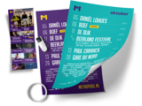
This brought the number of stages from two to six, and added a music café. We wrote a strategic plan for this brand repositioning. In addition, we changed Metropool’s appearance (re-branding) and designed a variety of communication means.

Web portal
One of these means of communication is the web portal www.metropool.nl.
Our developers and UI/UX designers created a user friendly, easy to control and beautifully designed website, focusing on ticket sales.

#whataboutM
We wanted to get people excited about the new Metropool brand. So, we came up with the idea for a #whataboutM campaign: an activation campaign with different phases, focusing only on the M-logo. We used a promo team, city displays and a contest in a micro website to make sure the M was visible – both online and offline – in the entire region. Eventually we revealed the secretive M during a kick-ass party in Enschede.

Result
In collaboration with Metropool’s core team, we’ve worked on this new branding (and the new web portal) in secret for months. We couldn’t be more proud of the results!

Contact
We would like to hear from you
Raymond
Strategy Director and Co-Founder


